
Case study · Personal product

Just

A strength-training app for iOS
that decides today's workout for you.
Designed and built solo with AI agents,
in private beta with three lifters.
Role
Product, research, UX/UI, iOS build
Timeline
Since May 2026, beta since August
Platform
iOS 17+, iPhone
Stack
SwiftUI, SwiftData, HealthKit, WidgetKit
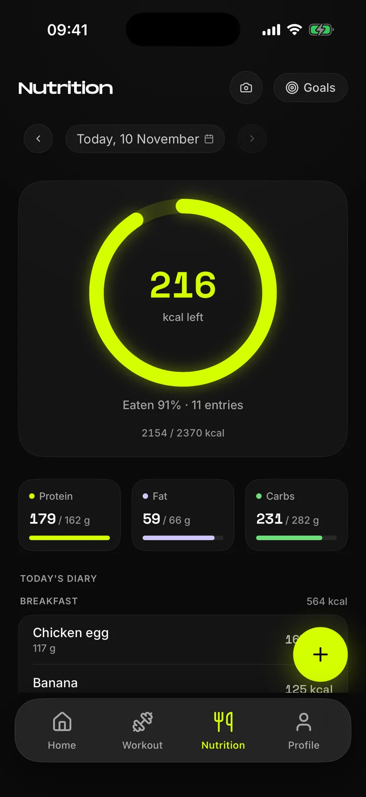
Nutrition diary with calorie ring
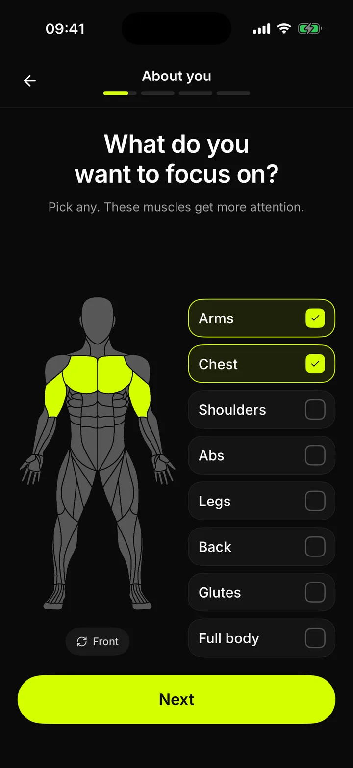
Onboarding: choosing focus muscles on a body map
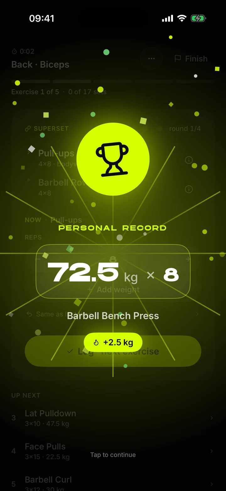
Personal record screen: Barbell Bench Press 72.5 kg × 8
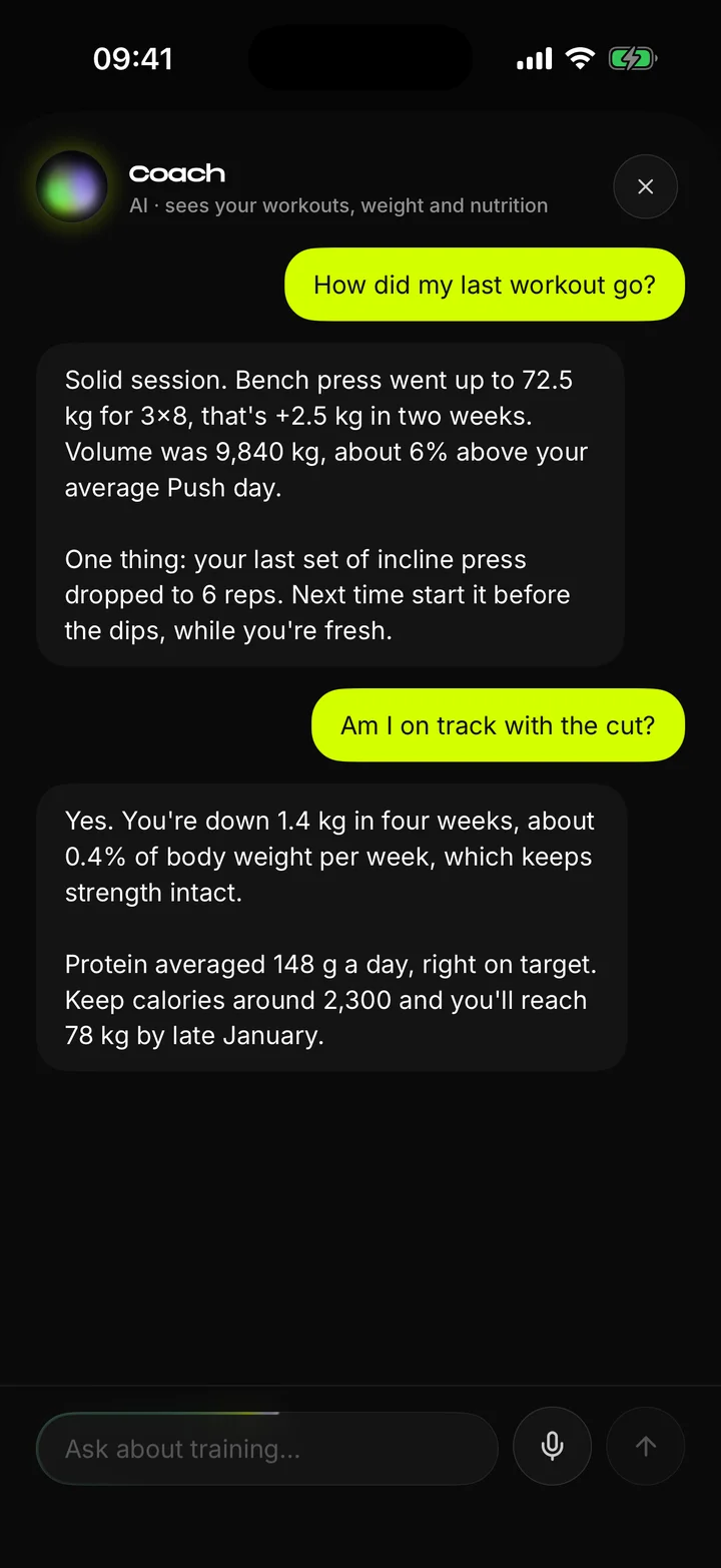
AI coach chat

Overview

A log that tells you what to lift

Most strength apps are empty spreadsheets: you bring the plan, they store the numbers. Just starts from the other end. It picks today's workout, prefills every set and raises the weight when your last session says you are ready. No account, no feed, no subscription.

Just is in private beta. Three lifters have trained with it for three months and logged about 50 workouts. Every build reaches them first, and their sessions decide what gets built next.

  • 1,189exercises with animations
  • 27ready programs
  • 13onboarding steps
  • 3languagesEN · UK · RU

Three rules behind every screen

  • Decide for the lifterThe app chooses today's workout and the next weight. The lifter only confirms.
  • One action per screenThe thing you came for is the largest thing you see. Everything else waits lower.
  • Nothing leaves the phone without a yesTraining data stays on the device. The AI coach stays off until you agree to it.

Problem

Every app wanted something from me

I train four days a week, and every app I tried charged for the basics, pushed a social feed or left half the screen in English. Before designing anything, I reviewed 20 of them to find out what was actually missing.

  • Offline and privateTable stakes. Most loggers already work offline, so it can't be the reason to switch.
  • Auto-progressionAlready owned. One competitor is named after it and goes deeper than a first version could.
  • The real gapNo app with solid progression speaks Ukrainian or Russian natively. Local apps have the language and none of the logic. That became the position.
  • Proof in the gymA gap on paper is still a guess. Three lifters on test builds turned it into evidence, and their sessions now set the roadmap.

Research and calls

Twenty apps, three lifters

I read store reviews and forum threads for 20 strength apps and kept only complaints I could trace to a source. Then I ran calls with three lifters of different levels, watched them use test builds and noted every place they hesitated. Each hesitation became a design change.

  • 20apps reviewed
  • 3lifters on calls
  • 4flows changed after the calls
  • 4competitor complaints confirmed

What the reviews said

  • HevyNeeds a connection to log a set. One user asked why it can't just save offline.
  • JEFITNotification spam with no fine control, a popup after every set that blocks logging, a rest timer that turns itself back on.
  • SubscriptionsA common story: three months paid before noticing the app isn't used.
  • OfflineNot an edge on its own. Strong, FitNotes and JEFIT all work offline.

What the calls changed

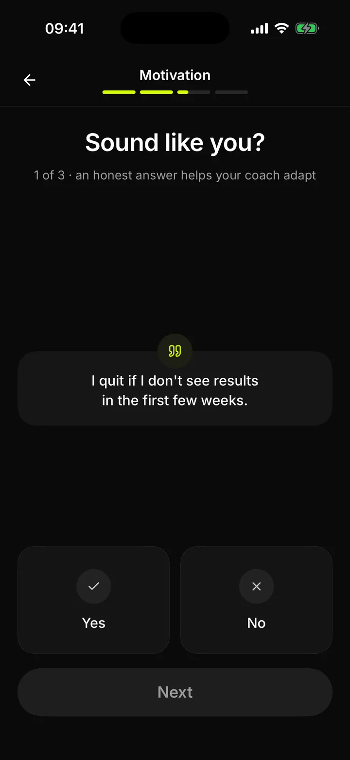
  • OnboardingPeople stalled on open-ended steps. It became 13 one-answer screens with a progress bar and three short breaks that explain the method.
  • Rest timerNobody watches a countdown between sets. Now the end of rest is felt in the hand, not read.
  • Busy handsTapping with chalk or sweat is awkward. Volume buttons log a set, and a shake on Home opens today's workout.
  • RecordsLifters missed their own new bests. Now a record gets its own screen and a haptic beat for every step.

Wireframes

Structure before polish

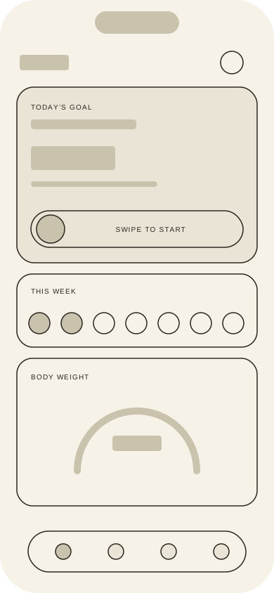
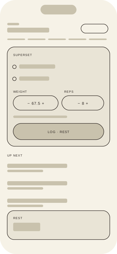
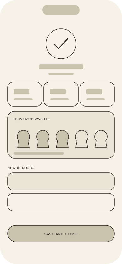
Every screen follows one rule: one primary action, the key number as the largest element, secondary data lower down. These frames are redrawn from the shipped screens to show that hierarchy. The real iterations happened in code: I designed directly in SwiftUI and judged every change on a working build.
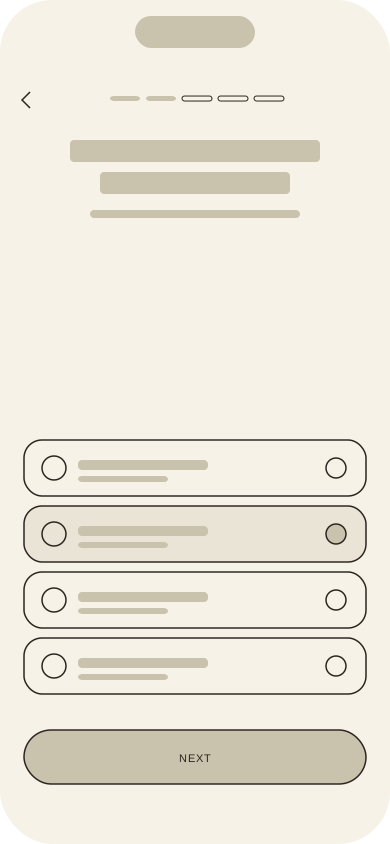
Low-fi wireframe: Onboarding step
Onboarding step
Low-fi wireframe: Home
Home
Low-fi wireframe: Active workout
Active workout
Low-fi wireframe: Summary
Summary

Onboarding

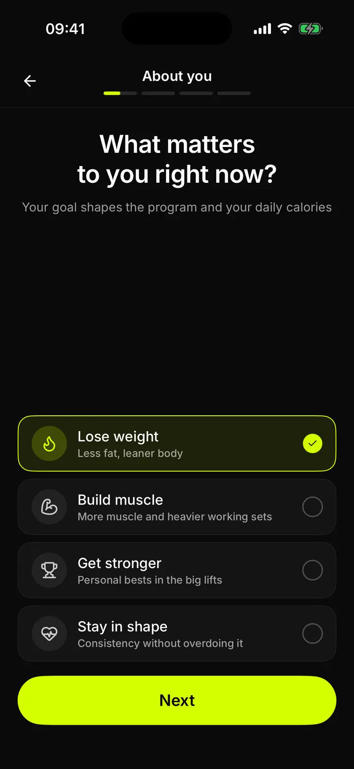
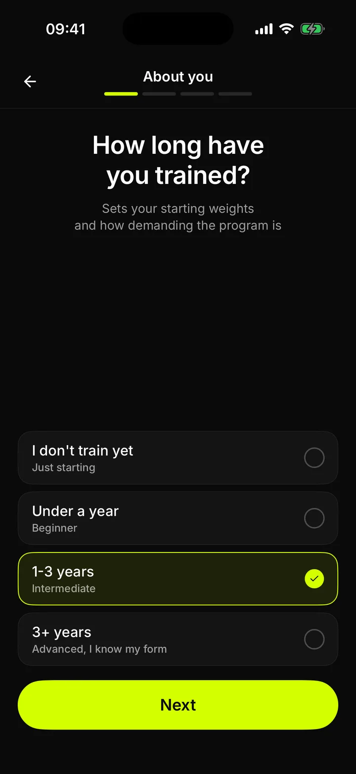
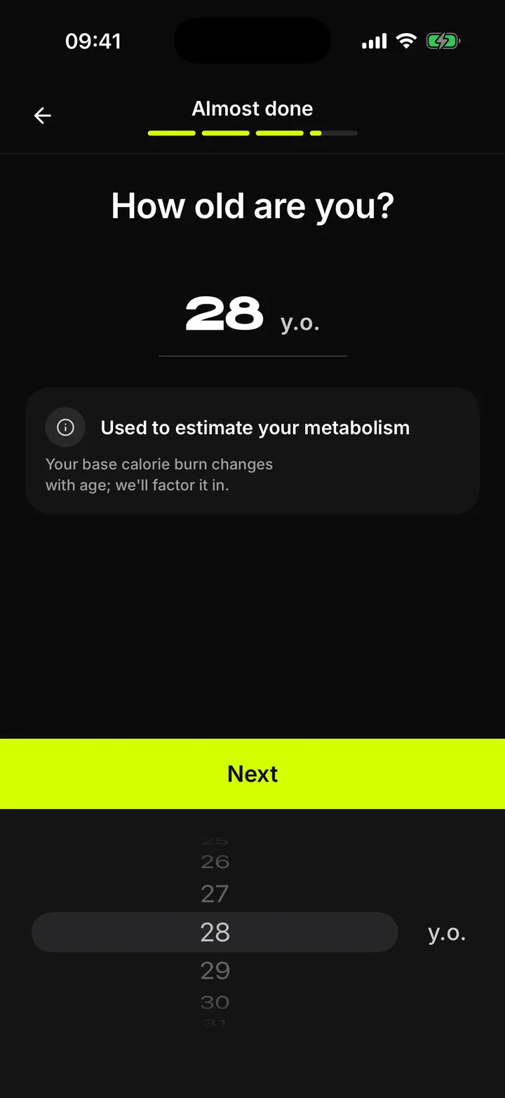
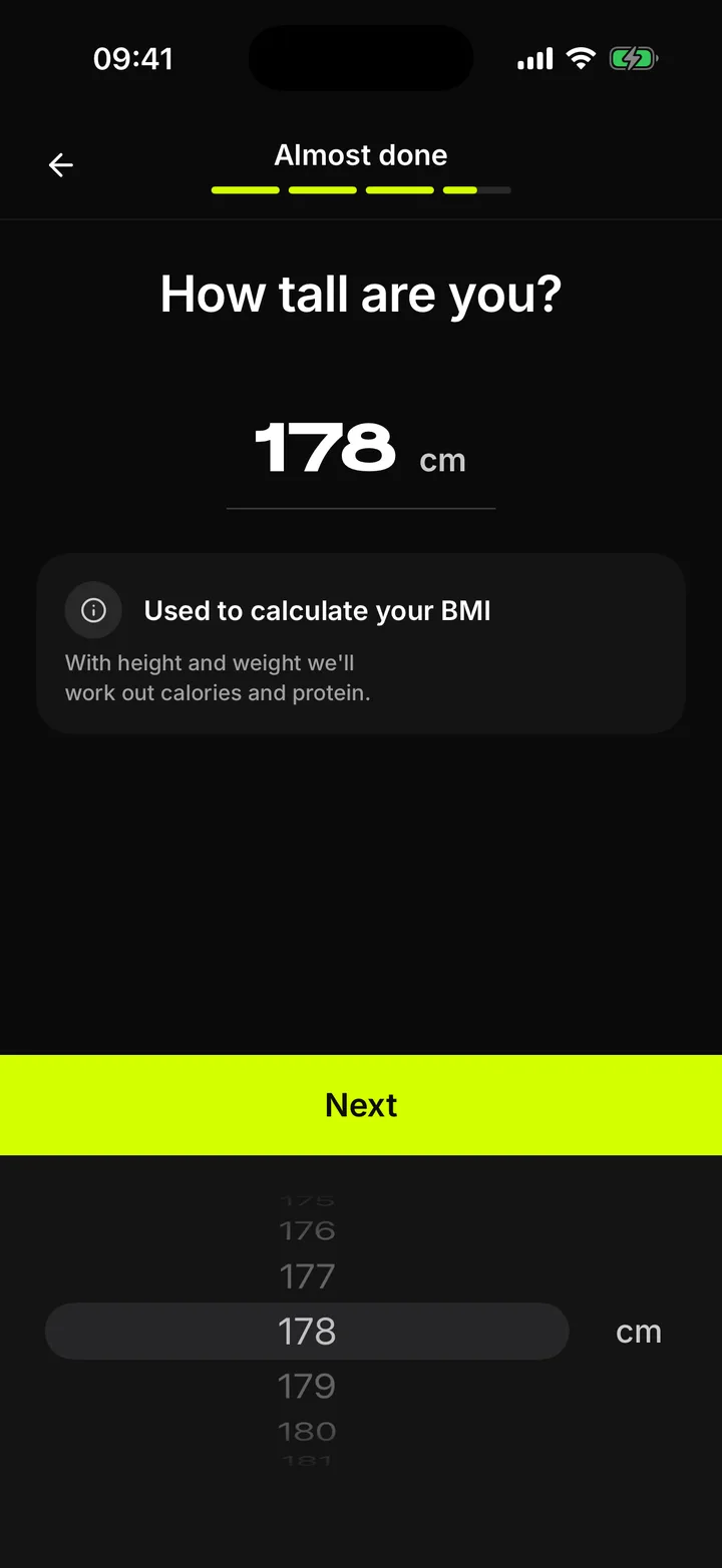
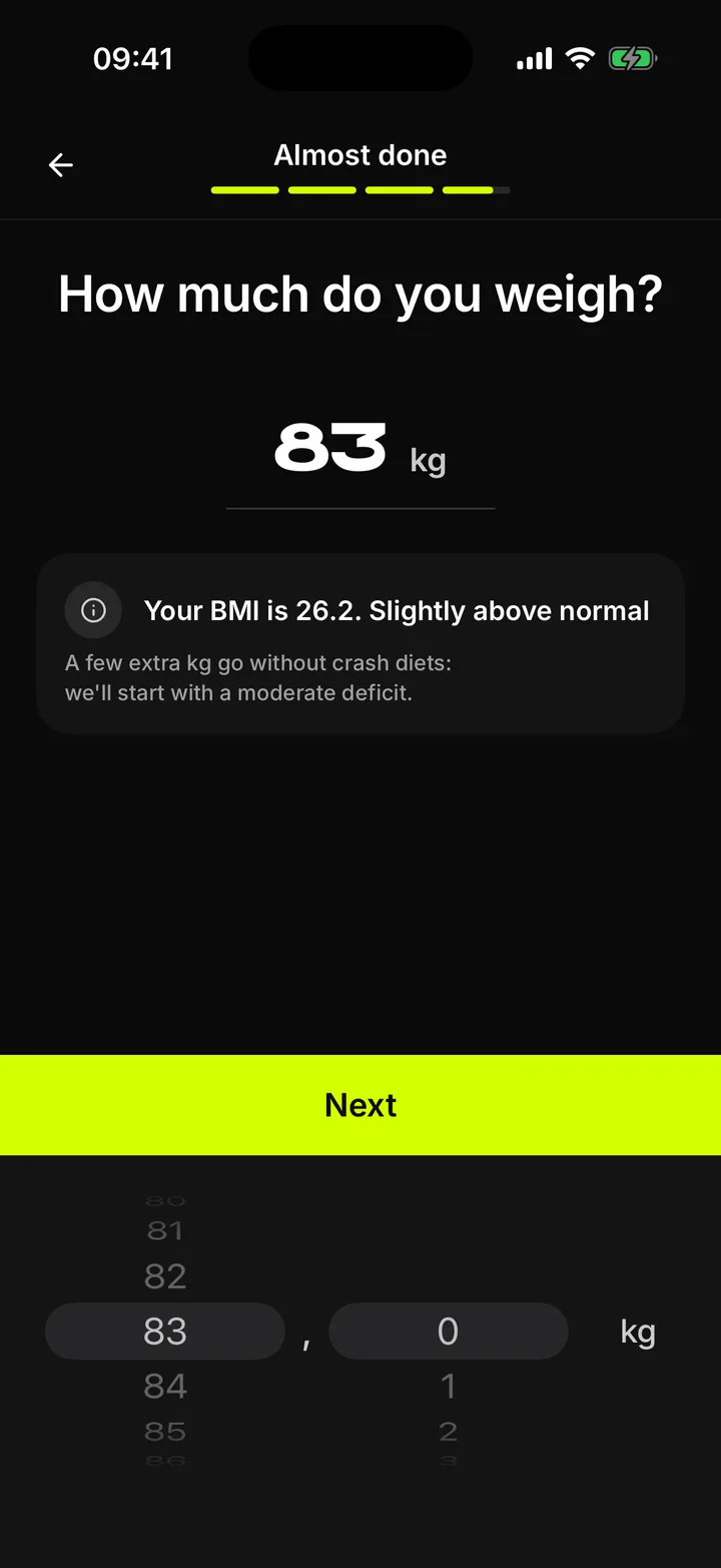
Thirteen questions, one program

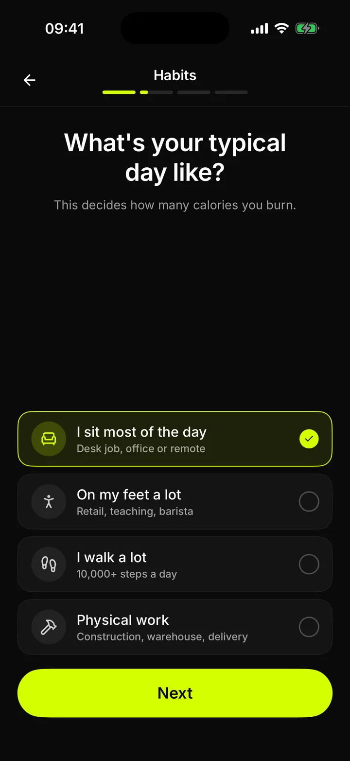
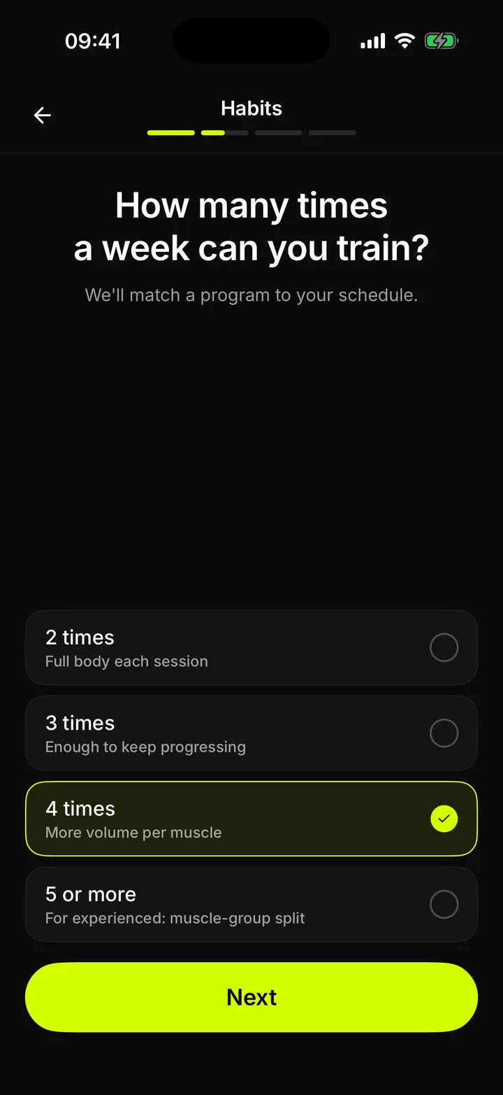
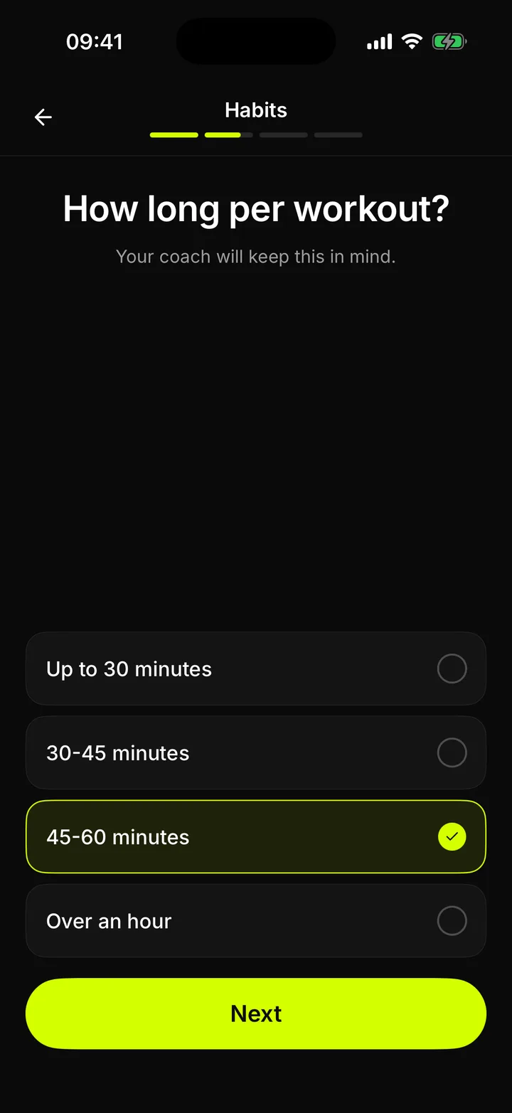
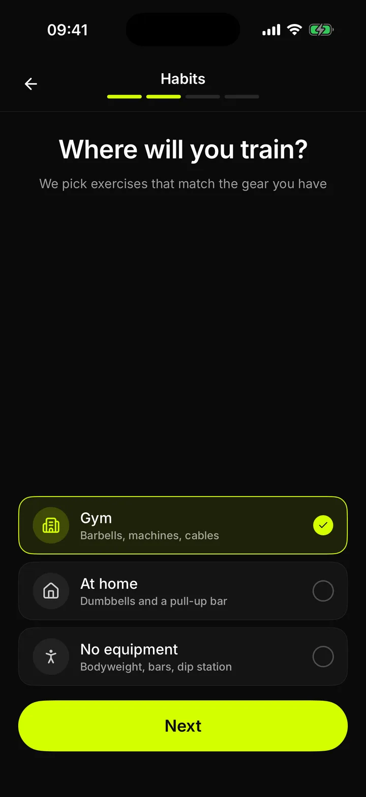
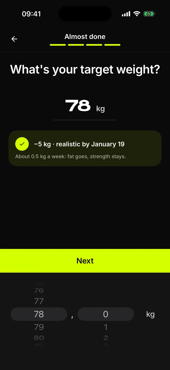
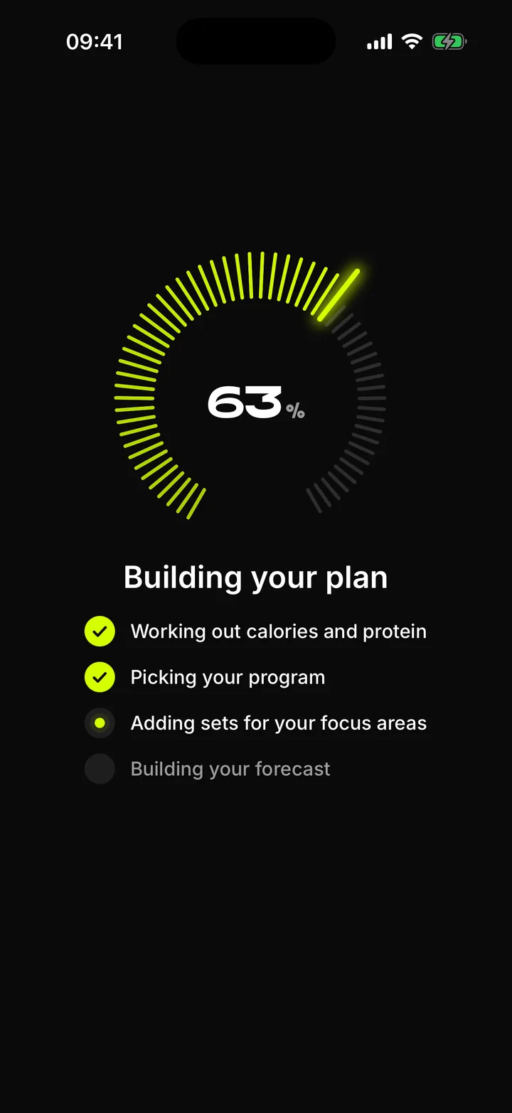
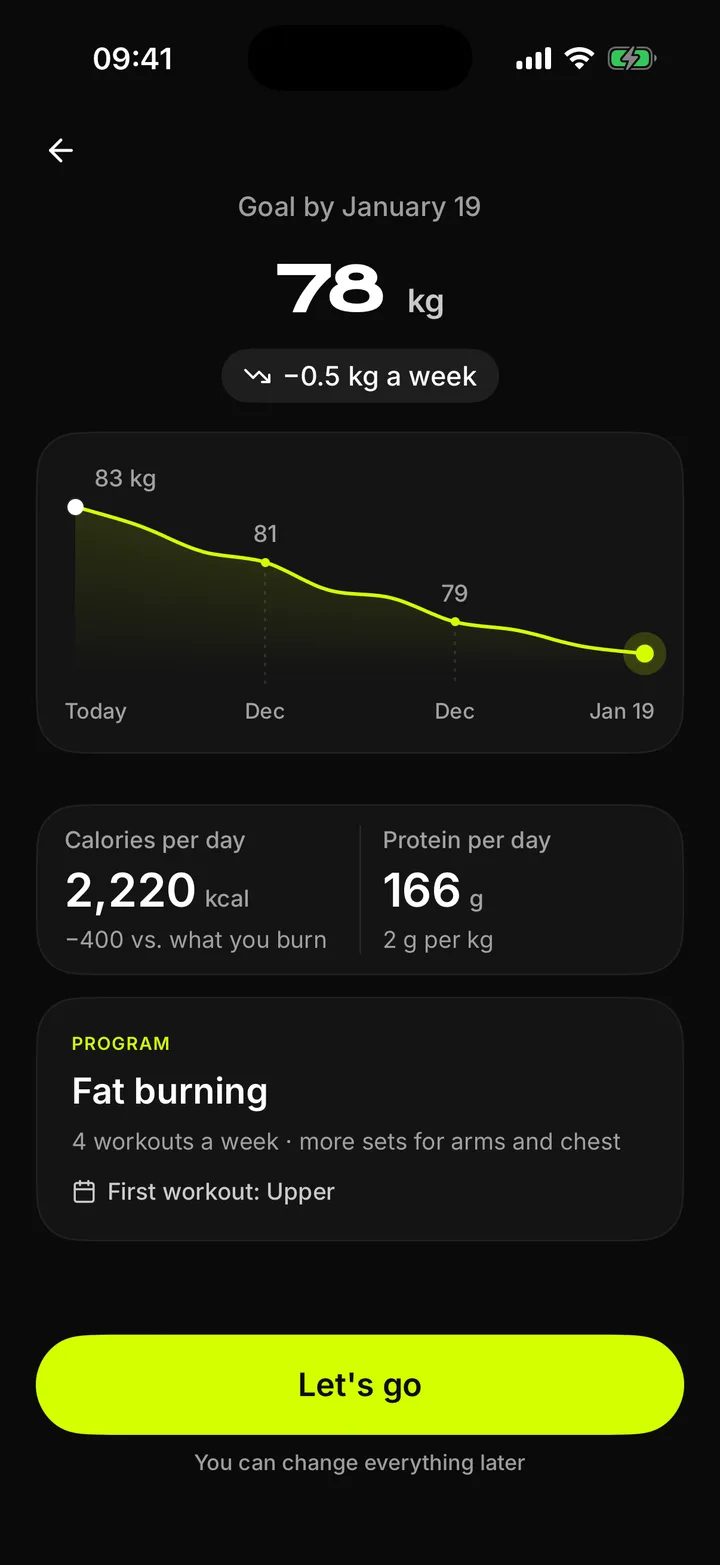
Thirteen questions about goal, experience, schedule and equipment, and the plan is built in front of you. Each screen asks one thing and fits one thumb. Three short breaks in the middle explain why the method works, so the flow reads as a conversation, not a form.
A real run in the simulator, slightly sped up.
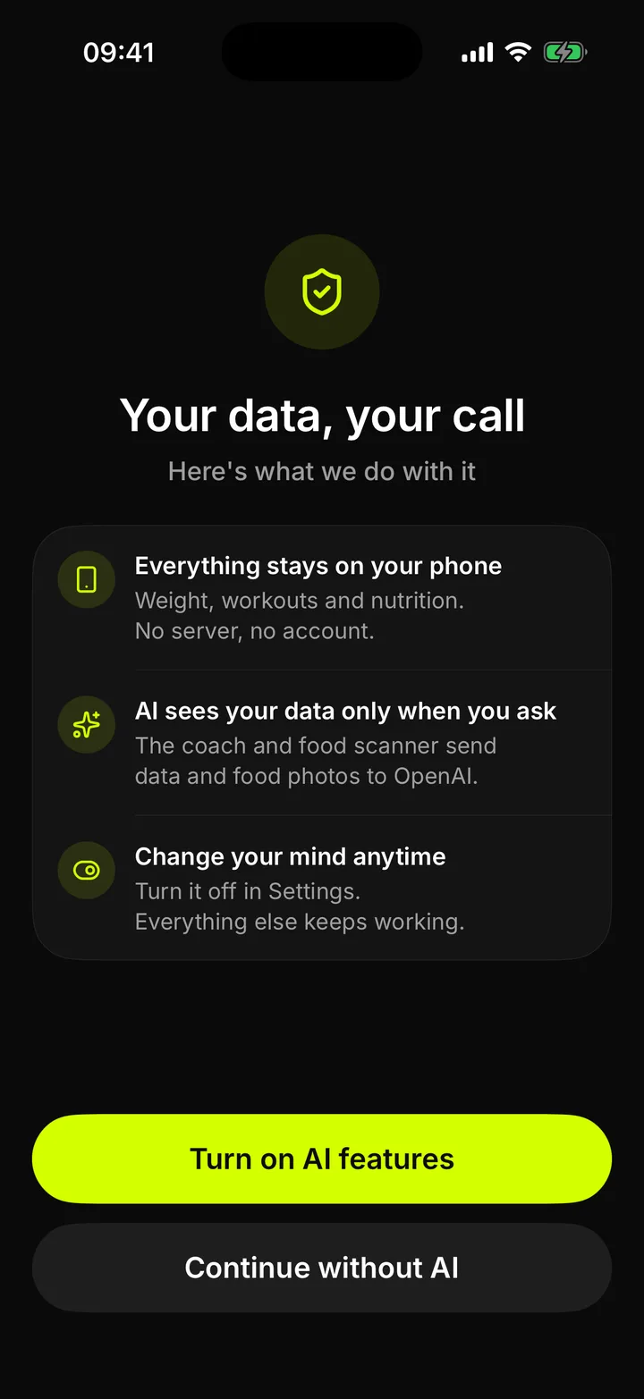
  • Onboarding step: Data consent
    Data consent
  • Onboarding step: Goal
    Goal
  • Onboarding step: Focus areas
    Focus areas
  • Onboarding step: Experience
    Experience
  • Onboarding step: Daily routine
    Daily routine
  • Onboarding step: Days per week
    Days per week
  • Onboarding step: Session length
    Session length
  • Onboarding step: Equipment
    Equipment
  • Onboarding step: Why it works
    Why it works
  • Onboarding step: Age
    Age
  • Onboarding step: Height
    Height
  • Onboarding step: Weight
    Weight
  • Onboarding step: Goal weight
    Goal weight
  • Onboarding step: Building the plan
    Building the plan
  • Onboarding step: Your program
    Your program
Drag or scroll sideways. From the first question to a matched program.

Home

Nineteen versions of one screen

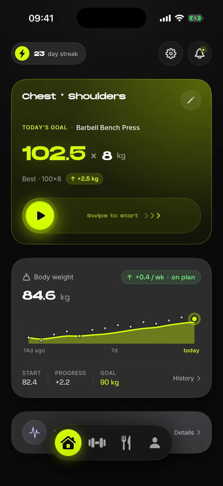
The first builds showed charts, streaks and tips at once, and nobody knew where to look. Nineteen versions later, Home answers one question: what do I lift today. The next workout leads, the week and the month follow, and body weight and recovery sit lower for the days you want to look back. Lifters in the beta say the marked training days are what keeps them coming back.
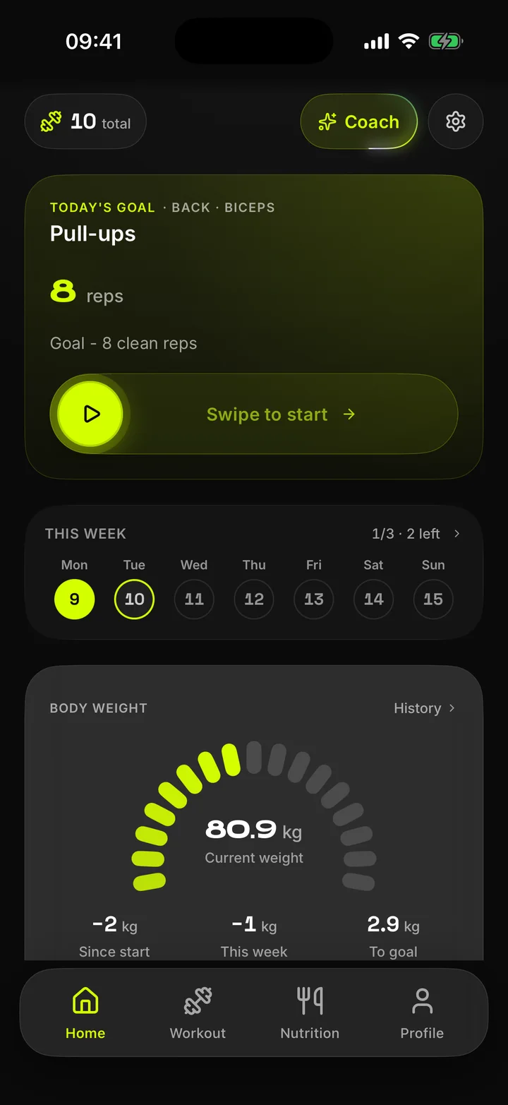
Home screen today
The first home screen, May 2026
Drag to compare. The first build from May on the left, today on the right.

Workout

One tap per set

The most repeated action in the app had to be the cheapest. Weight and reps arrive prefilled from the plan and the last session, one button logs the set and starts the rest timer, and a changed weight carries over to the remaining sets. Supersets share one card. If iOS closes the app mid-workout, the session resumes where it stopped.
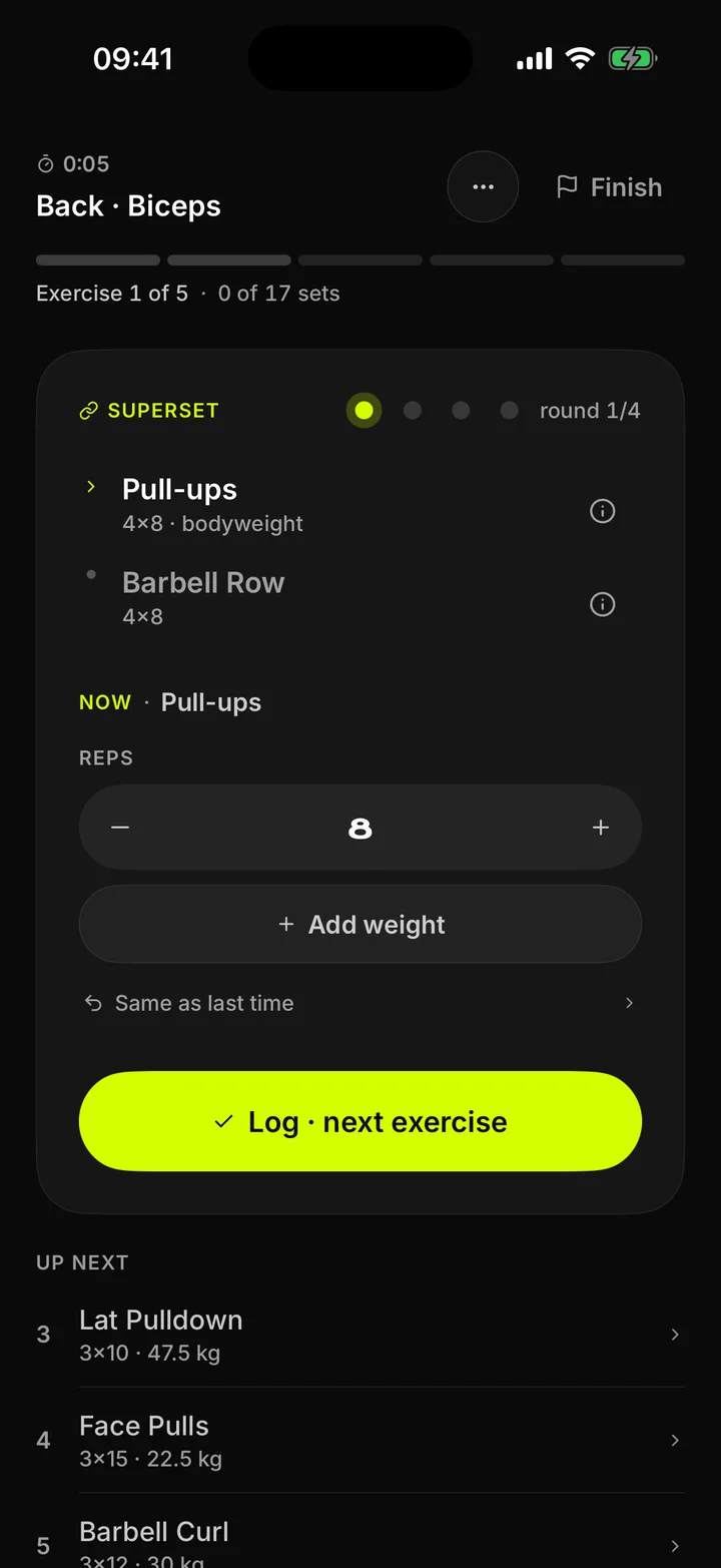
Superset card with Pull-ups and Barbell Row
Start, log, rest. The superset card and the technique sheet, one tap away.

Micro-interactions

Every tap answers back

More than a hundred haptic moments, tuned like a type scale. Light taps answer steppers and toggles, medium ones confirm a step, and heavy ones are saved for the few moments that matter. Motion and haptics share one timeline, and animations step back when Reduce Motion is on.

Haptic calls in the code, by strength

  • light83
  • medium21
  • heavy6
  • soft5
  • rigid2
  • End of restTwo quiet pulses in the last seconds, a firmer one at zero. A paired Mi band buzzes too.
  • Swipe to startThe lime circle follows the thumb, and the workout starts with a tap and a soft glide sound.
  • Volume buttonsLog a set without looking. The system volume pop-up stays hidden and your music keeps playing.
  • ShakeOn Home, a shake jumps straight into today's workout. Both gestures can be turned off.

Sound

Fourteen quiet sounds

Fourteen short sounds, rendered from Bencho Sounds recipes. They follow the silent switch, play under your music instead of pausing it and never fire twice within 60 ms, so fast taps stay clean. One toggle in Settings turns them off.

Tap to listen. Headphones help, they are meant to be quiet.

After the workout

Effort in kettlebells

A 1 to 10 effort scale asks for a number at the moment you are most tired. Just shows five kettlebells and one plain line under them, such as "Hard, 2 to 3 reps in reserve". That answer shapes the next session, and new records appear right below, counted only against lifts you have really done. The summary also shows the session's total tonnage, the number lifters check first.
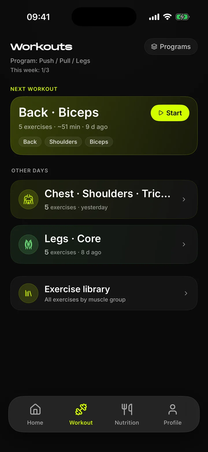
Workout tab with the next workout and other days
The summary feeds the next suggestion: more reps first, then more weight.

Records

A record should feel like one

Lifters on the calls missed their own new bests, so a record now gets three seconds of its own: the trophy, the new number, the exercise and the gain over the old best. Every step has its own haptic, so the moment lands even with the phone on the bench. Clean-install testing once caught three celebrations for the same 85 × 8 and praise measured against a planned estimate. Both are fixed: a record counts only against lifts you have really done.

The celebration in real time, recorded in the simulator.

Haptic beat of a record, first second

  1. Screen dimslight tap
  2. Trophy drops inmedium tap
  3. "Personal record"medium-strong
  4. The number landsstrongest tap
  5. Exercise namemedium tap
  6. +2.5 kg, sparklestrong, then fading

Muscle volume

Volume at a glance

Sets are counted per muscle over the last seven days: full credit for the main muscle, half for each secondary one, the same rule Hevy and Boostcamp use. Each group lands in a zone against its weekly target: low under 50%, on target up to 130%, high above. The first version was a table of numbers. A body map with bars shows a neglected muscle at a glance.
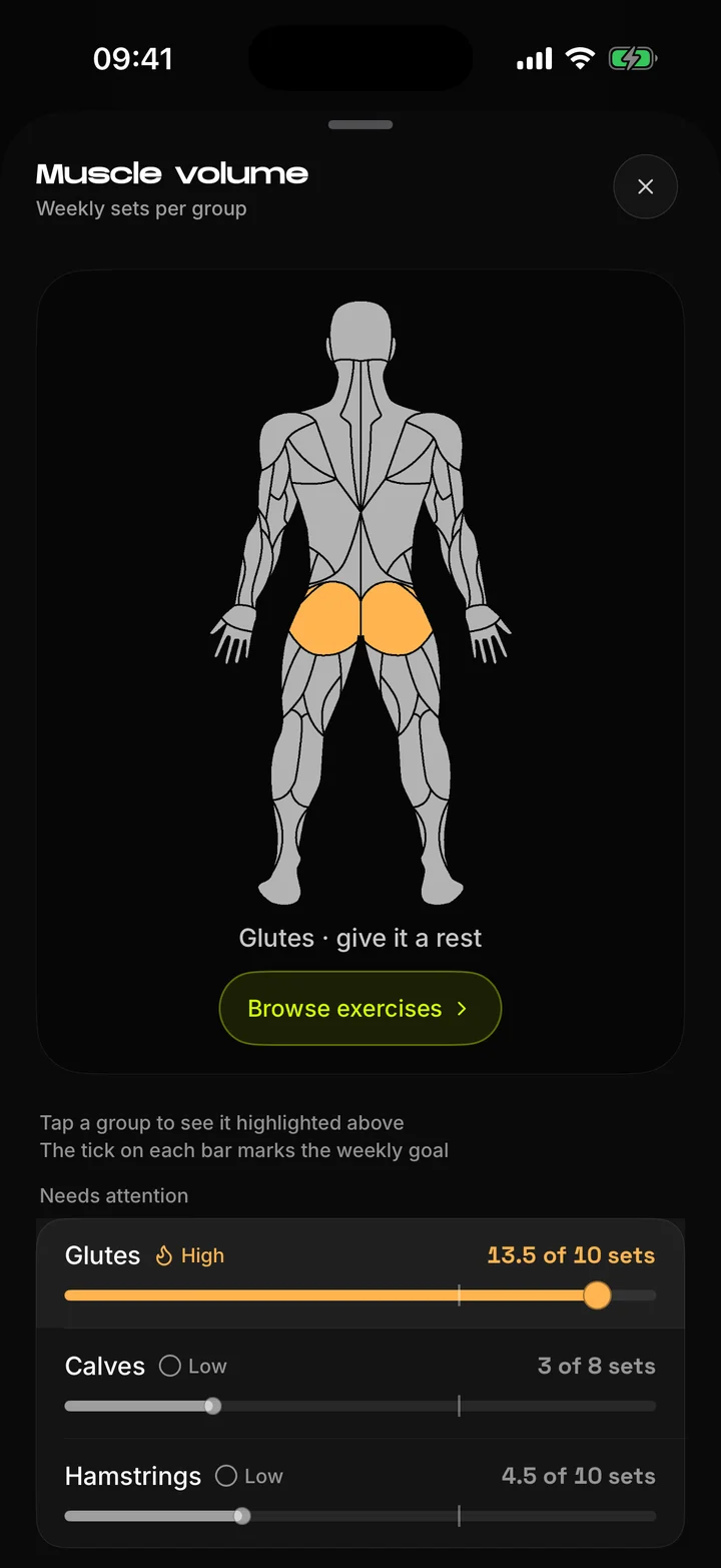
Muscle volume: body map and weekly sets per group
Body map in onboarding for choosing focus muscles
The same body map works in onboarding and in weekly volume.

Programs

27 programs, and your own

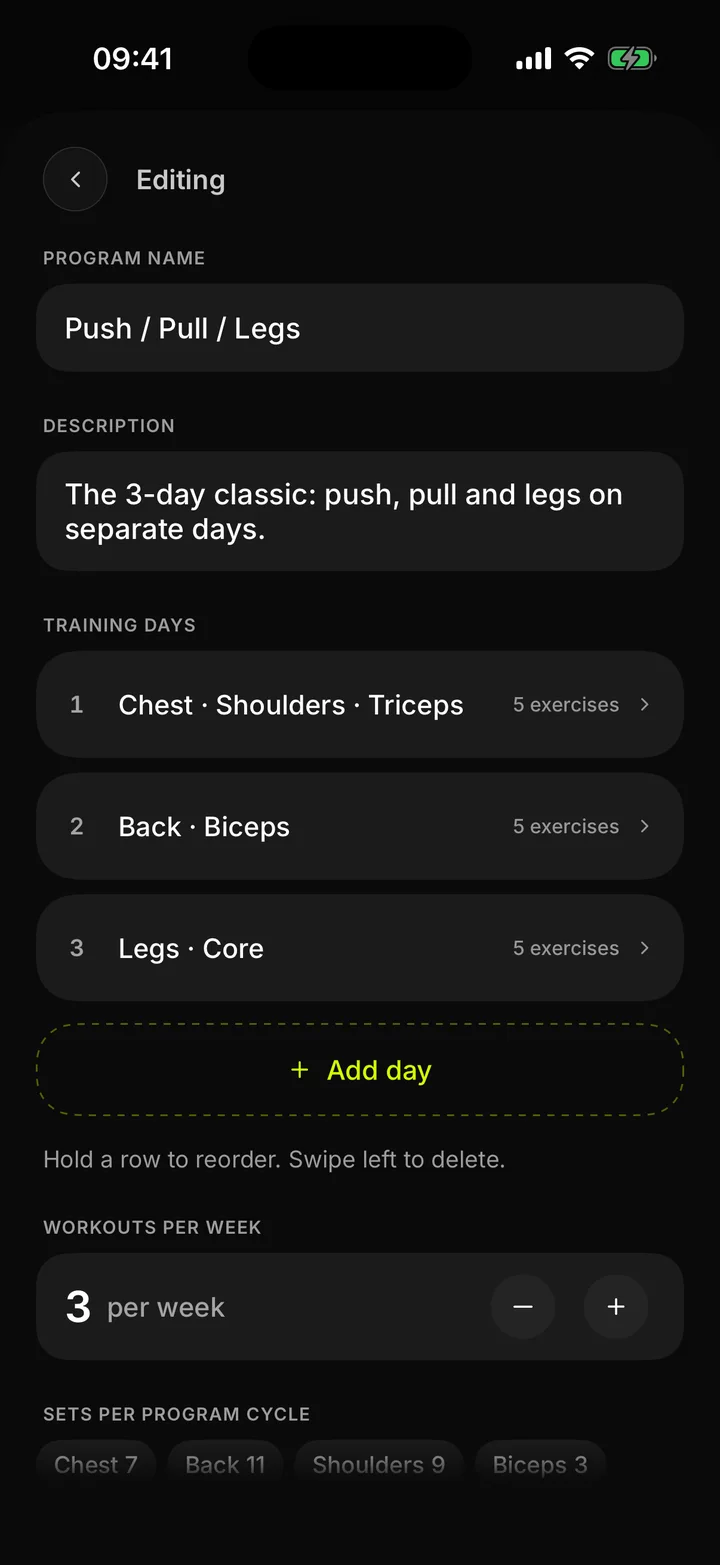
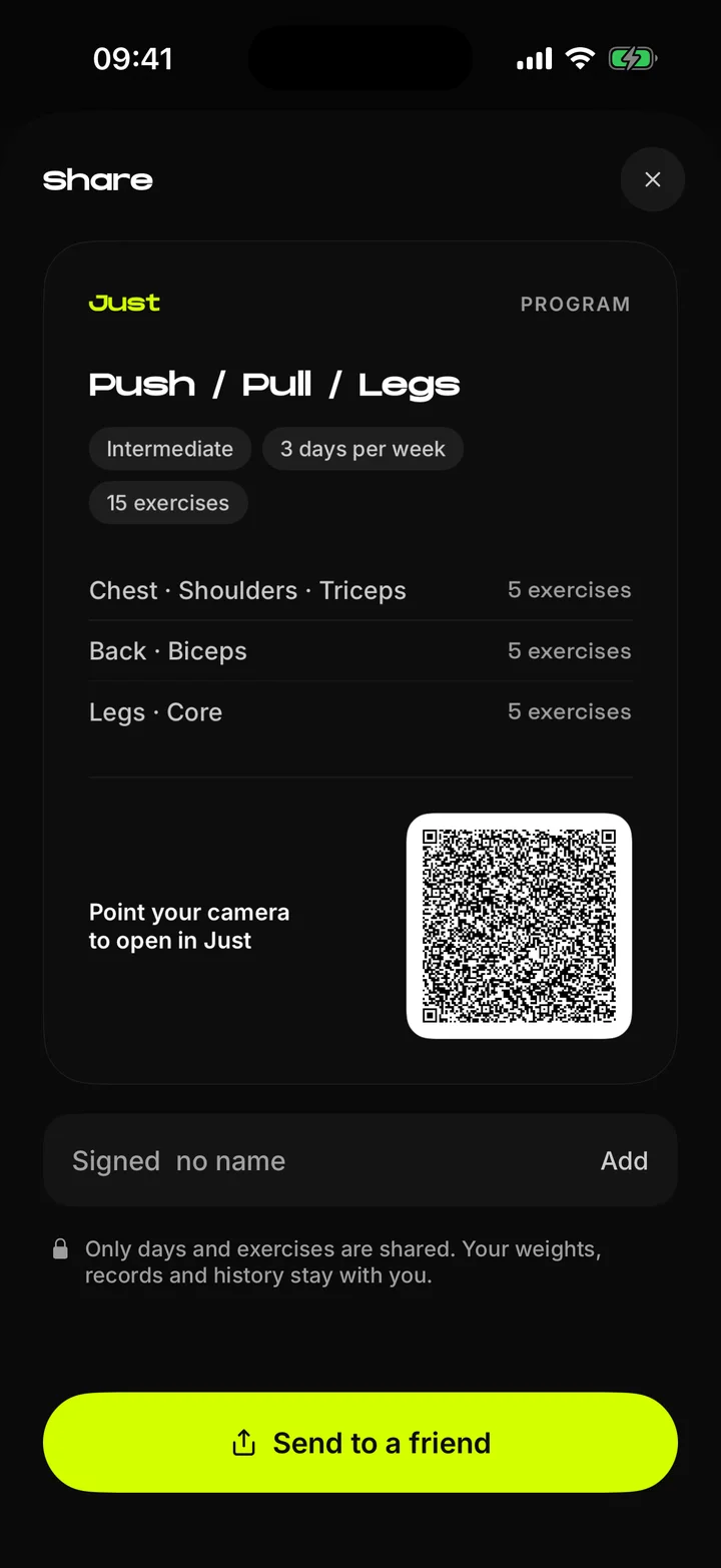
The catalog ranks 27 programs against your onboarding answers and explains each match. Lifters who want control build their own, with supersets and day templates, and share it by link or QR code. Only days and exercises travel. Weights and history stay on your phone.
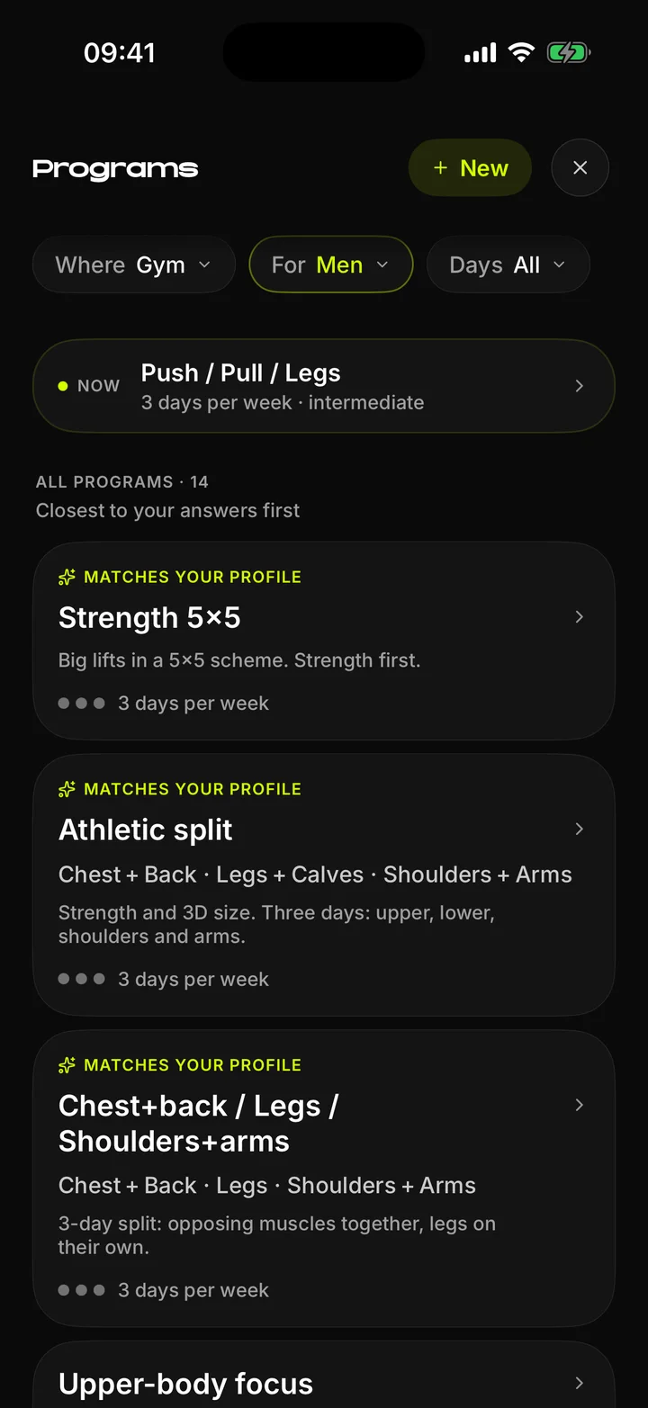
Program catalog with filters and matching programs
Program editor with training days
Share sheet with a QR code
Catalog, editor, sharing.

Nutrition and body

Food, weight and photos

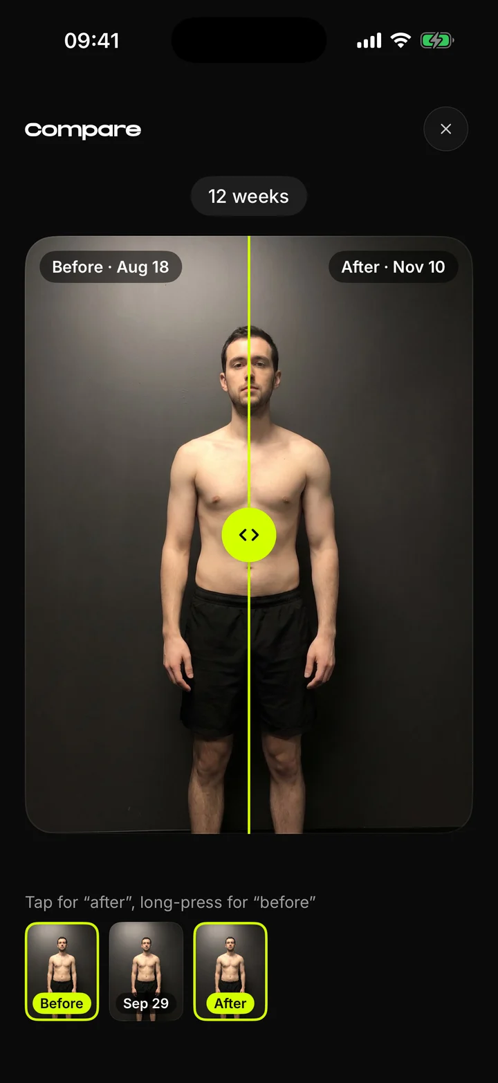
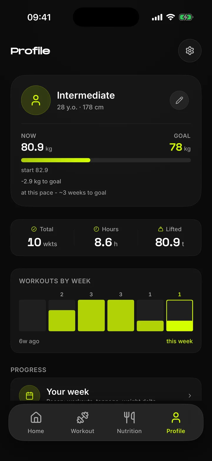
Strength is only part of the result, so the rest lives in the same app. Calories and macros fill a ring through the day, weight moves toward a goal with a pace estimate, and progress photos compare side by side with a slider.
Nutrition diary with calorie ring and macros
Profile with weight goal and workouts by week
Progress photo comparison
Nutrition, profile, photo compare.

Recovery

Recovery from your watch

Each morning Just reads last night's sleep, heart rate variability and resting heart rate from Apple Health, so it works with an Apple Watch or a Mi Band. The three signals become one readiness score from 0 to 100.

The score informs and never overrides. The plan stays the same, and the lifter decides how hard to go.

The ring fills to the score. Its colour follows the level.

AI coach

A coach, only if you let it

The coach answers questions about your workouts, weight and food in plain words, using your own log. It is off by default. Before anything leaves the phone, a consent screen shows exactly what is sent and where. Decline, and nothing else in the app changes.

Answers built from your own log, not generic tips.

Widgets

The week on your home screen

Three widgets: the streak with this week's progress, the next workout and a month calendar. The first set tried to show everything, and I sent it back. Now each widget says one thing and reads in a second.
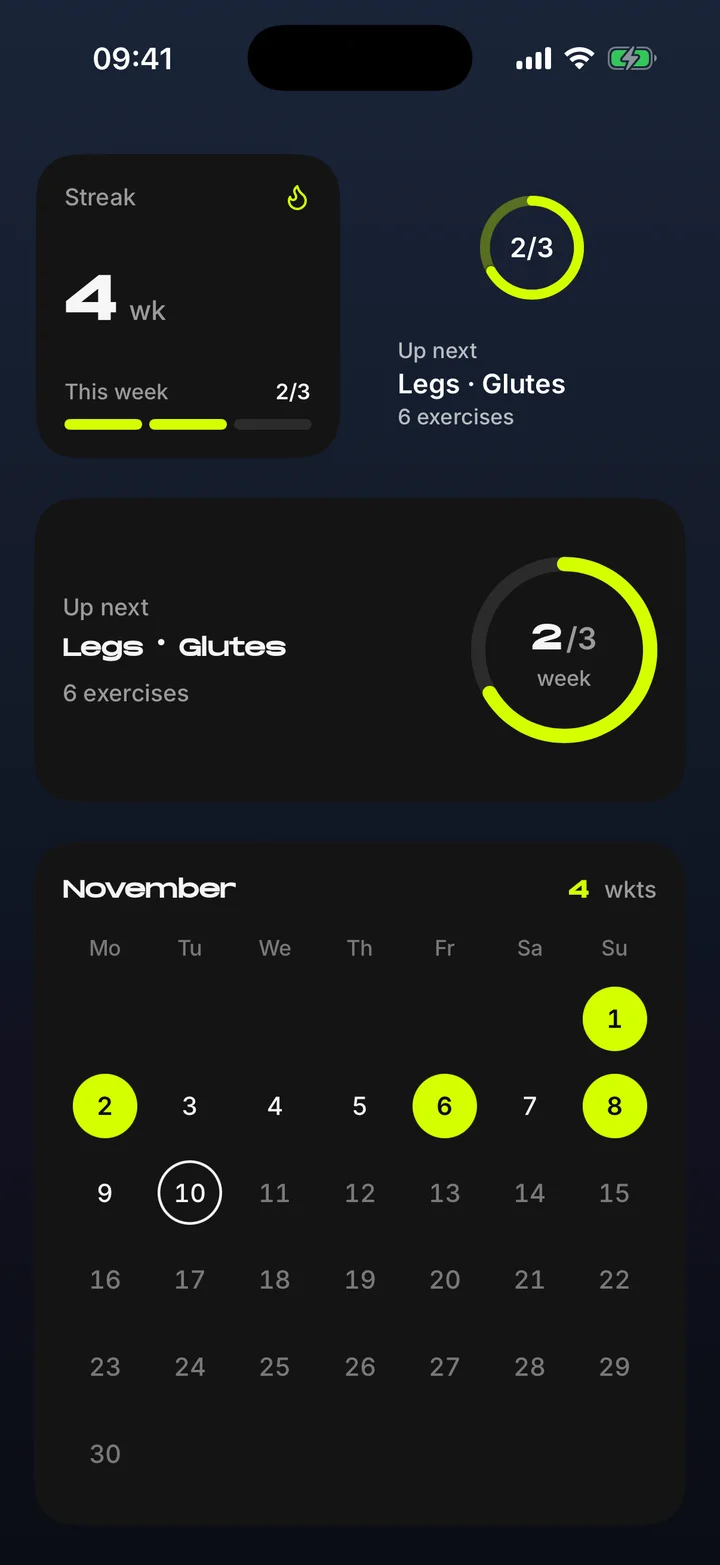
Home screen widgets: streak, next workout and month calendar
Small, medium and large sizes.

Design system

Dark only, one accent

Lime means "done" or "do this now" and nothing else. Tokens come in two tiers, raw values and roles, so no colour is ever picked by eye inside a screen.

  • Lime#D4FF00action, done
  • Lavender#D0C4FFsecondary data
  • Green#6EE07Aon target
  • Amber#FFB84Deffort, caution
  • Coral#FF7864over the limit
  • Ink#0A0A0A to #1A1A1Asurfaces
Type
Noken for numbers and titles, Inter for text, Space Grotesk for small data
Icons
Phosphor, one weight
Spacing
4-point scale, 4 to 48
Radius
16 for rows, 28 for cards, pill for controls
Feedback
Haptics and short sounds on set, rest and record
Accessibility
VoiceOver labels, reduce motion, contrast checked per screen

How it was built

A small team of one

AI agents wrote the Swift. I ran the project the way a product lead runs a team: a brief, a written plan, a review after every step and the final call on what ships.

  1. Plan before codeEvery feature starts as a written plan with checkboxes. Nothing is built until I approve it.
  2. Agents with rolesAnalyst, UX researcher, UI builder, accessibility auditor, developer and tester, in a fixed order.
  3. Review on a real buildEach screen is checked in the simulator and on my phone, not in a mock-up.
  4. Audits and clean runsMore than 20 audit cycles and full runs from a clean install to the end of a workout.
  5. A lessons fileEvery correction becomes a written rule, so the same mistake does not come back.
  6. Feedback from real usersThree lifters train on test builds. Their notes go into the backlog and come back as updates.
  • 48klines of Swift
  • 240+closed tasks
  • 20+audit cycles

What changed

What I took from it

  • 3lifters in private beta
  • 3months of weekly training
  • ~50workouts logged
  • 3/3set new personal records

What the lifters value

  • Tonnage per workoutThe total weight lifted in a session is the number they check first after the last set.
  • The week counterSeeing how many workouts are done this week keeps the streak going. It is the first thing they look at on Home.
  • Days on the calendarEvery training day stays marked on Home's month calendar. A full row is the motivation to come back.
  • Beating the last sessionLast session's numbers sit right in front of them, so each workout has a target. All three lifters set new personal records during the beta.
  1. Question your favourite feature first

    I first listed the kettlebell scale as a differentiator. Anyone could copy it in a week, so it came out of the positioning and stayed in the product.

  2. AI speeds up building, not deciding

    The agents wrote 48,000 lines of Swift. Deciding what to build, what to cut and when a screen was good enough stayed with me.

  3. Test on a clean install

    Half of the real defects appeared only when the app was installed from zero and used the way a stranger would.

Next case

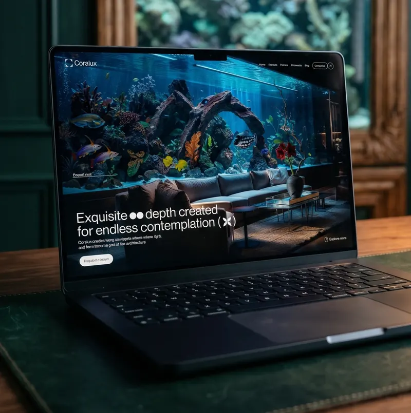
Coralux website on a laptop

Coralux

Role: UX/UI and visual design.
Website for an aquatic design studio. Dark, calm
visuals and a clear path to a commission request.

Elementra WordPress theme on a laptop in a library

Elementra

Role: UX/UI design, copy, AI imagery, design QA.
Multi-niche WordPress theme with demos for shops,
services and business sites. 4,500+ sales, 4.91 rating.

Let’s talk

Good work begins with
a good conversation

Open to full-time UX/UI and web design roles.
If you are hiring or have a project, I would like to hear about it.